The Replication Network
Furthering the Practice of Replication in Economics
PODCAST ALERT: “Can Academic Fraud Be Stopped? (Update)”
This is Part 2 of a two-part podcast series on academic fraud from Freakonomics.com hosted by Stephen Dubner. (See here for the TRN post about Part 1.) The original podcast was aired in January 2024 but was recently updated on January 1st, 2025.
Here is the description provided by Freakonomics:
“Last week’s episode was called “Why Is There So Much Fraud in Academia?” We heard about the alleged fraudsters, we heard about the whistleblowers, and then a lawsuit against the whistleblowers…We heard about feelings of betrayal, from a co-author who was also a longtime friend of the accused…We also heard an admission, from inside the house, that the house is on fire…”
“That episode was a little gossipy, for us at least. Today, we’re back to wonky. But don’t worry, it is still really interesting. Today, we look into the academic-research industry — and believe me, it is an industry. And there is misconduct everywhere. From the universities…There’s misconduct at academic journals, some of which are essentially fake…And we’ll hear how the rest of us contribute. Because, after all, we love these research findings…We’ll also hear from the reformers, who are trying to push back…”
“Can academic fraud be stopped? Let’s find out.”
Click here for the link.
A transcript of the podcast is provided online.
CLOSING THOUGHT: Why so little mention about replication!
PODCAST ALERT: “Why Is There So Much Fraud in Academia? (Update)”
Check out the following podcast on academic fraud from Freakonomics.com hosted by Stephen Dubner. Among other things, it provides fascinating details about the Francesca Gino fraud scandal, including interviews with Max Bazerman, one of Gino’s Harvard co-authors, and the Data Colada team that uncovered the fraud. The original podcast was aired in January 2024 but was recently updated on December 25th, 2024.
Here is the description provided by Freakonomics:
“Some of the biggest names in behavioral science stand accused of faking their results. Last year, an astonishing 10,000 research papers were retracted. In a series originally published in early 2024, we talk to whistleblowers, reformers, and a co-author who got caught up in the chaos. (Part 1 of 2)”
Click here for the link.
A transcript of the podcast is provided online.
Enjoy! (Not sure that is the right word!)
AoI*: “Do experimental asset market results replicate? High powered preregistered replications of 17 claims” by Huber et al. (2024)
[*AoI = “Articles of Interest” is a feature of TRN where we report abstracts of recent research related to replication and research integrity.]
ABSTRACT (taken from the article)
“Experimental asset markets provide a controlled approach to studying financial markets. We attempt to replicate 17 key results from four prominent studies, collecting new data from 166 markets with 1,544 participants. Only 3 of the 14 original results reported as statistically significant were successfully replicated, with an average replication effect size of 2.9% of the original estimates. We fail to replicate findings on emotions, self-control, and gender differences in bubble formation but confirm that experience reduces bubbles and cognitive skills explain trading success. Our study demonstrates the importance of replications in enhancing the credibility of scientific claims in this field.”
REFERENCE
AoI*: “Predicting the replicability of social and behavioural science claims in COVID-19 preprints” by Marcoci et al. (2024)
[*AoI = “Articles of Interest” is a feature of TRN where we report abstracts of recent research related to replication and research integrity.]
ABSTRACT (taken from the article)
“We elicited judgements from participants on 100 claims from preprints about an emerging area of research (COVID-19 pandemic) using an interactive structured elicitation protocol, and we conducted 29 new high-powered replications. After interacting with their peers, participant groups with lower task expertise (‘beginners’) updated their estimates and confidence in their judgements significantly more than groups with greater task expertise (‘experienced’). For experienced individuals, the average accuracy was 0.57 (95% CI: [0.53, 0.61]) after interaction, and they correctly classified 61% of claims; beginners’ average accuracy was 0.58 (95% CI: [0.54, 0.62]), correctly classifying 69% of claims. The difference in accuracy between groups was not statistically significant and their judgements on the full set of claims were correlated (r(98) = 0.48, P < 0.001). These results suggest that both beginners and more-experienced participants using a structured process have some ability to make better-than-chance predictions about the reliability of ‘fast science’ under conditions of high uncertainty. However, given the importance of such assessments for making evidence-based critical decisions in a crisis, more research is required to understand who the right experts in forecasting replicability are and how their judgements ought to be elicited.”
REFERENCE
CFP: Voluntas Special Issue – Advancing Nonprofit and Civil Society Research through Replication
[The following is excerpted from the webpage of the ISTR: International Society for Third- Sector Research. For the full announcement, see here: CFP: Voluntas Special Issue – Advancing Nonprofit and Civil Society Research through Replication – www.istr.org]
We call for papers dedicated to replicating studies within the field of nonprofit and civil society research. This field addresses vital issues and generates findings meant to inform the practical actions and policies impacting nonprofit organizations. Topics of interest include governance and management of nonprofit organizations, charitable donations (whether money, time, goods, or biological materials), volunteering, fundraising strategies, social movements, advocacy, and community-based organizing…
Despite the numerous benefits of replication, however, the culture of publishing replication studies in the field of nonprofit and civil society studies is still in its infancy. Leading journals in the field have published only a small – though growing number – of studies that focus on or include a strong element of replication…
This special issue calls for replications of studies within the nonprofit and civil society research community, to correct inadvertent errors in previous research (e.g., due to programming errors), to safeguard against questionable research practices (e.g., p-hacking), and to test the robustness of results against sensible methodological variations.
We therefore seek contributions that replicate studies about civil society issues. We invite a wide range of such replications:
– Articles of up to 8000 words (including shorter research note-style articles that may be below this word limit),
– replicating one original study, or a bundle of related original studies,
– dealing with individuals, organizations, or other units of analysis, and using naturally or experimentally generated data.
We particularly welcome submissions that
– engage with theories that have been highly influential in the research field, or that focus on issue of wide practical relevance to civil society and nonprofit organizations,
– are the first to replicate an important previous study,
– feature author independence between replication and original research,
– engage in exact replication (i.e., repeating every element of the original design) as well as constructive replication (i.e., purposefully improving at least one element of the original design, such as measures, data types, or inference methods…).
– move from quantitative designs with lower to those with higher statistical power,
– examine how findings from widely studied contexts can be generalized to understudied contexts, such as marginalized groups or the Global South,
– have preregistered their research designs at least prior to the beginning of data analysis, in line with best practices of Open Science,
– make their data and other research materials publicly available upon submission.
TIMELINE
The review process for this special issue will consist of two phases: an open review presubmission phase, and an anonymous review after formal submission.
Pre-Submission Phase
To enter this phase, please submit your full manuscript via email to the corresponding guest editor, Florentine Maier (Florentine.maier@wu.ac.at), for an initial screening and open peer review. Two guest editors will be assigned to your manuscript, who will provide feedback and may request revisions as a prerequisite for advancing to the next phase.
Manuscripts are welcome from now until the deadline of January 1, 2026.
Submissions will be reviewed and processed as quickly as possible to facilitate timely progression to the next stage.
Anonymous Peer Review
Once your manuscript has been cleared in the presubmission phase, please submit it through the regular VOLUNTAS submission system, marking it as a submission for the special issue. Manuscripts that advance to this stage will have met a high standard of quality and relevance, reducing the likelihood of desk rejections. The VOLUNTAS editors-in-chief will desk review each submission and assign additional reviewers for a formal anonymous peer review, after which the final editorial decision will be made.
Accepted manuscripts will be published online first, and the complete special issue will be available by July 1, 2027, at the latest.
Guest editors
René Bekkers (Vrije Universiteit Amsterdam)
Florentine Maier (WU Vienna University of Economics and Business)
Richard Steinberg (Indiana University Indianapolis)
REED: Do a DAG Before You Do a Specification Curve Analysis
My previous two blogs focused on how to do a specification curve analysis (SCA) using the R package “specr” (here) and the Stata program “speccurve” (here). Both blogs provided line-by-line explanations of code that allowed one to reproduce the specification curve analysis in Coupé (see here).
Coupé included 320 model specifications for his specification curve analysis. But why 320? Why not 220? Or 420? And why the specific combinations of models, samples, variables, and dependent variables that he chose?
To be fair, Coupé was a replication project, so it took as given the specification choices made by the respective studies it was replicating. But, in general, how DOES one decide which model specifications to include?
Del Giudice & Gangestad (2021)
In their seminar article, “Mapping the Multiverse: A Framework for the Evaluation of Analytic Decisions”, Del Giudice & Gangestad (2021), henceforth DG&G, provide an excellent framework for how to choose model specifications for SCA. They make a persuasive argument for using Directed Acyclic Graphs (DAGs).
The rest of this blog summarizes the key points in their paper and uses it as a template for how to select specifications for one’s own SCA.
Using a DAG to Model the Effect of Inflammation on Depression
DG&G’s focus their analysis on a hypothetical example: a study of the effect of inflammation on depression. Accordingly, they present the DAG below to represent the causal model relating inflammation (the treatment variable) to depression (the outcome variable).
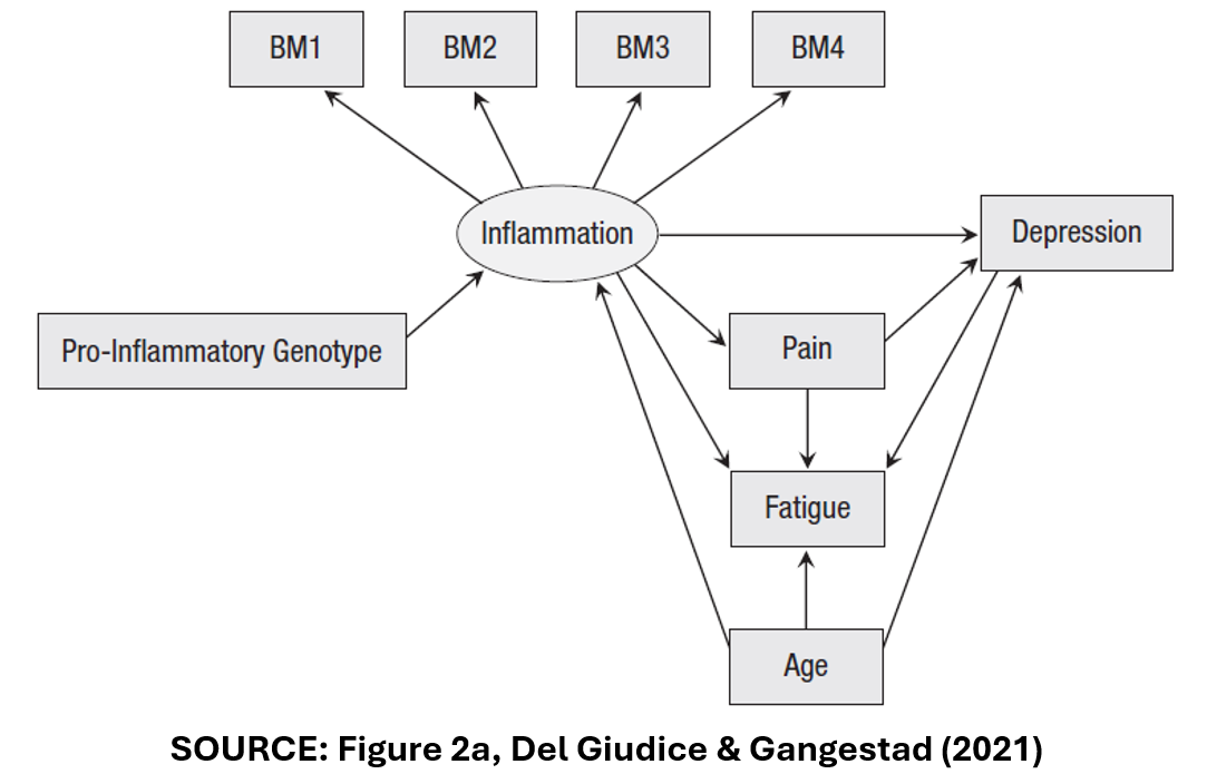
The Variables
In this DAG, “Inflammation” is assumed to have a direct effect on “Depression”. It is also assumed to have an indirect effect on “Depression” via the pathway of “Pain”.
“Inflammation” is measured in multiple ways. There are four, separate measures of inflammation, “BM1”-“BM4” that may or may not be correlated.
“Age” is a confounder. It affects both “Inflammation” and “Depression”.
“Fatigue” is a collider variable. It affects neither “Inflammation” nor “Depression”. Rather, it is affected by them. “Pain” and “Age” also affect “Fatigue”.
Lastly, “Pro-inflammatory genotype” represents the effect that one’s DNA has on their predisposition to inflammation.
One way to build model specifications is to combine all possible variables and samples. There are four different measures of the treatment variable “Inflammation” (“BM1”-“BM4”).
There are four “control” variables: “Pro-inflammatory Genotype”, “Pain”, “Fatigue”, and “Age”.
The authors also identify three different ways of handling outliers.
In the end, DG&G arrive at 1,216 possible combinations of model characteristics. Should a SCA include all of these?
Three Types of Specifications
To answer this question, DG&G define three types of model specifications: (i) Principled Equivalence (“Type E”), (ii) Principled Non-equivalence (“Type N”), and (iii) Uncertainty (“Type U”).
Here is how they describe the three categories:
“In Type E decisions (principled equivalence), the alternative specifications can be expected to be practically equivalent, and choices among them can be regarded as effectively arbitrary.”
“In Type N decisions (principled nonequivalence), the alternative specifications are nonequivalent according to one or more nonequivalence criteria. As a result, some of the alternatives can be regarded as objectively more reasonable or better justified than the others.”
“…in Type U decisions (uncertainty), there are no compelling reasons to expect equivalence or nonequivalence, or there are reasons to suspect nonequivalence but not enough information to specify which alternatives are better justified.”
Using Type E and Type N to Select Specifications for the SCA
I next show how these three types guide the selection of specifications for SCA in the “Inflammation”-“Depression” study example.
First, we need to identify the effect we are interested in estimating. Are we interested in the direct effect of “Inflammation” on “Depression”? If so, then we want to include the variable “Pain” and thus separate the direct from the indirect effect.
Specifications with “Pain” and without “Pain” are not equivalent. They measure different things. Thus, equivalent (“Type E”) specifications of the direct effect of “Inflammation” on “Depression” should always include “Pain” in the model specification.
Likewise, for the variable “Age”. “Age” is a confounder. One needs to control its independent effect on “Inflammation” and “Depression”. Accordingly, “Age” should always be included in the specification. Variable specifications that do not include “Age” will be biased. They are “Type N” specifications. Specifications that do not include “Age” should not be included in the SCA.
How about “Fatigue”? “Fatigue” is a collider variable. “Inflammation” and “Depression” affect “Fatigue”, but “Fatigue” does not affect them. In fact, including “Fatigue” in the specification will bias estimates of “Inflammation’s” direct effect. To see this, suppose “Fatigue” = “Inflammation” + “Depression”.
If “Inflammation” increases, and “Fatigue” is held constant by including it in the regression, “Depression” must necessarily decrease. Including “Fatigue” would induce a negative bias in estimates of the effect of “Inflammation” on “Depression”. Thus, specifications that include “Fatigue” are Type N specifications and should not be included in the SCA.
What do DG&G’s categories have to say about “Pro-inflammatory Genotype” and the multiple measures of the treatment variable (“BM1”-“BM4”)? As “Pro-inflammatory Genotype” has no effect on “Depression”, the only effect of including it in the regression is to reduce the independent variance of “Inflammation”.
While this leaves the associated estimates unbiased, it diminishes the precision of the estimated treatment effect. As a result, specifications that include “Pro-inflammatory Genotype” are inferior (“Type N”) to those that omit this variable.
Finally, there are multiple ways to use the four measures, “BM1” to “BM4”. One could include specifications with each one separately. One could create composite measures, that additively combine the individual biomarkers; such as “BM1+BM2”, “BM1+BM3”,…, “BM1+BM2+BM3+BM4”.
Should all of the corresponding specifications be included in the SCA? DG&G state that “composite measures of a construct are usually more valid and reliable than individual indicators.” However, “if some of the indicators are known to be invalid, composites that exclude them will predictably yield higher validities.”
Following some preliminary analysis that raised doubts about the validity of BM4, DG&G concluded that only the composites “BM1+BM2+BM3+BM4” and “BM1+BM2+BM3” were “principled equivalents” and should be included in the SCA.
The last element in DG&G’s analysis was addressing the problem of outliers. They considered three alternative ways of handling outliers. All were considered to be “equivalent” and superior to using the full sample.
In the end, DG&G cut down the number of specifications in the SCA from 1,216 to six, where the six consisted of specifications that allowed two alternative composite measures of the treatment variable, and three alternative samples corresponding to each of the three ways of handling outliers. All specifications included (and only included) the control variables, “Age” and “Pain”.
Type U
The observant reader might note that we did not make use of the third category of specifications, Type U for “Uncertainty”. DG&G give the following DAG as an example.
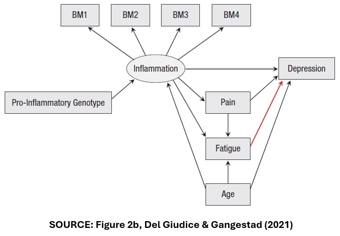
In Figure 2b, “Fatigue” is no longer a collider variable. Instead, it is a mediator variable like “Pain”. Accordingly, DG&G identify six specifications for this DAG, with two alternative composite measures of “Inflammation”, three ways of addressing outliers, and all specifications including (and only including), the control variables, “Pain”, “Fatigue”, and “Age”.
DG&G argue that it would be wrong to include these six specifications with the previous six specifications. The associated estimates of the treatment effect are likely to be hugely different depending on whether “Fatigue” is a collider or a mediator.
But how can we know which DAG is correct? DG&G argue that we can’t. The true model is “uncertain”, so DG&G recommend that we should conduct separate SCAs, one for the DAG in Figure 2a, and one for the DAG in Figure 2b.
DG&G Conclude
DG&G conclude their paper by addressing the discomfort that researchers may experience when doing a SCA that only has six, or a relatively small number of model specifications:
“Some readers may feel that, no matter how well justified, a multiverse of six specifications is too small, and that a credible analysis requires many more models—perhaps a few dozen or hundreds at a minimum. We argue that this intuition should be actively resisted. If a smaller, homogeneous multiverse yields better inferences than a larger one that includes many nonequivalent specifications, it should clearly be preferred.”
Extensions
There are many scenarios that DG&G do not address in their paper, but in principle the framework is easily extended. Consider alternative estimation procedures. If the researcher does not have strong priors that one estimation procedure is superior to the other, then both could be assumed to be “equivalent” and should be included.
Consider another scenario: Suppose the researcher suspects endogeneity and uses instrumental variables to correct for endogeneity bias. In this case, one might consider IV methods to be superior to OLS, so that the two methods were not “equivalent” and only IV estimates should be included in the SCA.
Alternatively, suppose there is evidence of endogeneity, but the instruments are weak so that the researcher cannot know which is the “best” method. As IV and OLS are expected to produce different estimates, one might argue that this is conceptually similar to the “Fatigue” case above. Following DG&G, this would be considered a Type U scenario, and separate SCAs should be performed for each of the estimation procedures.
Final Thoughts
It’s not all black and white. In the previous example, since the researcher cannot determine whether OLS or IV is better, why not forget Type U and combine the specifications in one SCA?
This highlights a tension between two goals of SCA. One goal is to narrow down the set of specifications to those most likely to identify the “true” effect, and then observe the range of estimates within this set.
Another goal is less prescriptive about the “best” specifications. Rather, it is interested in identifying factors associated with the heterogeneity among estimates. A good example of this approach is TABLE 1 in the “specr” and “speccurve” blogs identified at the top of this post.
Despite this subjectivity, DAGs provide a useful approach for identifying sensible specifications for a SCA. Everybody should do a DAG before doing a specification curve analysis!
NOTE: Bob Reed is Professor of Economics and the Director of UCMeta at the University of Canterbury. He can be reached at bob.reed@canterbury.ac.nz.
REFERENCES
REED: Using the Stata Package “speccurve” to Do Specification Curve Analysis
NOTE: The data (“COUPE.dta”) and code (“speccurve_program.do”) used for this blog can be found here: https://osf.io/4yrxs/
In a previous post (see here), I provided a step-by-step procedure for using the R package “specr”. The specific application was reproducing the specification curve analysis from a paper by Tom Coupé and coauthors (see here).
“speccurve”
In this post, I do the same, only this time using the Stata program “speccurve” (Andresen, 2020). The goal is to facilitate Stata users to produce their own specification curve analyses. In what follows, I presume the reader has read my previous post so that I can go straight into the code.
The first step is to download and install the Stata program “speccurve” from GitHub:

There isn’t a lot of documentation for “speccurve.” The associated GitHub site includes an .ado file that provides examples (“speccurve_gendata.ado”). Another example is provided by this independent site (though ignore the bit about factor variables, as that is now outdated).
“speccurve” does not do everything that “specr” does, but it will allow us to produce versions of FIGURE 1 and TABLE 1. (Also, FIGURE 2, though for large numbers of specifications, the output isn’t useful.)
What “speccurve” Can Do
Here is the “speccurve” version of FIGURE 1 from my previous post:

And here are the results for TABLE 1:

How about FIGURE2? Ummm, not so helpful (see below). I will explain later.

Unlike “specr”, “speccurve” does not automatically create combinations of model features for you. You have to create your own. “speccurve” is primarily a function for plotting a specification curve after you have estimated your selected specifications. The latter is typically done by creating a series of for loops.
Downloading Data and Code, Setting the Working Directory, Reading in the Data
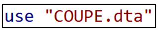
Once you have installed “speccurve”, the next step is to create a folder, download the the dataset “COUPE.dta” and code “speccurve_program.do” from the OSF website (here), and store them in the folder. COUPE.dta is a Stata version of the COUPE.RData dataset described in the previous post.
The following section provides an explanation for each line of code in “speccurve_program.do”.
The command line below sets the working directory equal to the folder where the data are stored.

The next step clears the working memory.
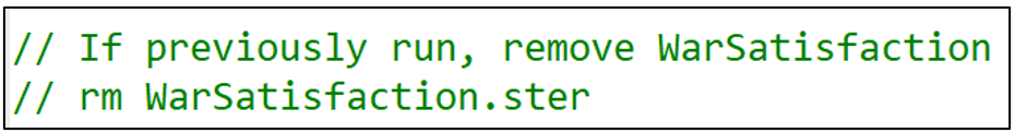
“speccurve” stores results in a “.ster” file. If you have previously run the program and created a “.ster” file, it is good practice to remove it before you run the program again. In this example, I have called the .ster file “WarSatisfaction”. To remove this file, delete the comment markers from the second line of code below and run.
Now import the Stata dataset “COUPE”.
Making Variables for the For Loops
Recall from the previous post that Coupé created 320 specifications by combining the following model characteristics: (i) two dependent variables, (ii) four samples, (iii) eight variables, and (iv) five models. Many of these had cumbersome names. Since I will reproduce Coupé’s specifications using for loops, I want to simplify the respective names.
For example, rather than referring to “lifesatisfaction15” and “lifesatisfaction110”, I create duplicate variables and name them “y1” and “y2”. Likewise, I create and name four sample variables, “sample1” to “sample4”.

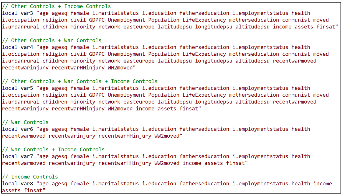
Having done this for “y” and “sample”, I now want to do the same thing for the different variable specifications. There were eight variable combinations. I create a “local macro” for each one, associating the names “var1” to “var8” with specific sets of variables.
For example, “var1” refers to the set of variables that Coupé collectively referred to “No Additional Controls”.

“var2” refers to the set of variables Coupé called “Other Controls”.

In this way, all eight of the variable sets receive “shorthand” names “var1” to “var8”.
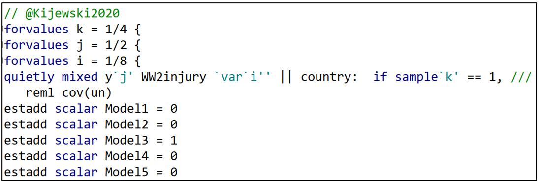
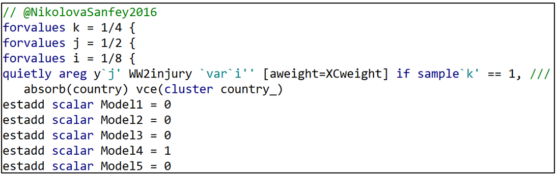
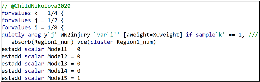
A For Loop for All the Djankovetal2016 Specifications
We now get to the heart of the program. I create another local macro called “no” that will assign a number (= “no”) to each of the models I estimate (model1-model320). I initialize “no” at “1”.

I write separate for loops for each of the five models, starting with Djankovetal2016.
I set up three levels of for loops. Starting from the outside (top), there are four types of samples (sample1-sample4), two types of dependent variables (y1-y2) and eight variable sets (var1-var8).
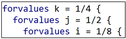
Djankovetal2016 estimates a weighted, linear regression model without fixed effects so I reproduce that estimation approach here. Note how “i”, “j”, and “k” allow different combinations of variables, dependent variables, and samples, respectively.

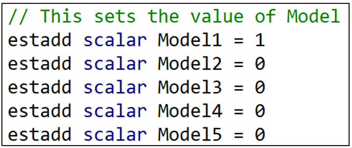
The next lines of commands identify which model we are estimating. The “estadd” command creates a variable that assigns either a “1” or a “0” depending on the model. Since the first model is Djankovetal2016, Model1 = 1 and all the other Model variables (Model2-Model5) are set = 0. ”estadd” saves the model variables so that we can identify the estimation model that each specification uses.
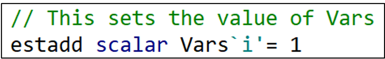
I next do the same thing for variable sets. Recall that the “i” indicator loops through eight variable specifications. When “i” = 1, the variable “Vars1” takes the value 1. When “i” = 2, the variable “Vars2” takes the value 1. And so on.
Having set the “right” Vars variable to “1”, I then set all the other Vars variables to “0”. That’s what the next set of commands do.
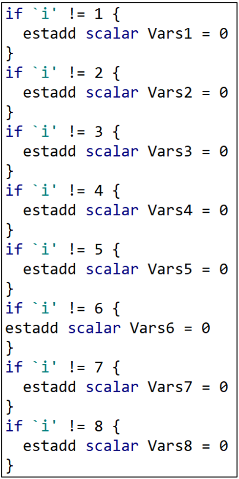
If “i” is not equal to 1, then Vars1 = 0. If “i” is not equal to 2, then Vars2 = 0. At the end of this section, all the Vars variables have been set = 0 except for the one variable combination that is being used in that regression.
I next do the exact same thing for the dependent variable, Y. “j” takes the values “1” or “2” depending on which dependent variable is being used. When “j” = 1, Y1 = 1. When “j” = 2, Y2 = 1. The remaining lines set Y2 = 0 or Y1 = 0 depending if “j” = 1 or 2, respectively.

And then the same thing for the sample variables.

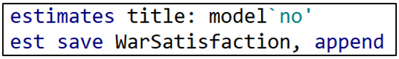
The next two lines save the results in a (“.ster”) file called “WarSatisfaction” and assigns each set of results a unique model number (“model1”-“model320”).
The last few lines of this for loop increases the “no” count by 1, and then the three right hand brackets finish off the three levels of the for loop.

For Loops for the Other 4 Estimation Models
Having estimated all the specifications associated with the Djankovetal2016 model, I proceed similarly for the other four estimation models.

Producing the Specification Curve
After running all 320 model specifications and storing them in the file “WarSatisfaction”, the “speccurve” command below produces the sought-after specification curve.
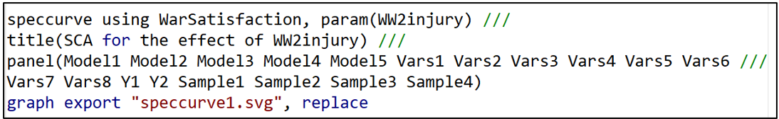
The option “param” lets “speccurve” know which coefficient estimate it should use. “title” is the name given to the figure produced by “speccurve”. “panel” produces the box below the figure (see below), the analogue of FIGURE 2 in the “specr” post.

Ideally, the panel sits below the specification curve and identifies the specific model characteristics that are associated with each of the 320 estimates. However, with so many specifications, it is squished down to an illegible box . If the reader finds this annoying, they can safely omit the “panel’ option.
Producing the Regression Results for TABLE 1
To produce TABLE 1, we need to access a table that is automatically produced by “speccurve” and stored in a matrix called “r(table)”. The following command prints out “r(table)” for inspection.
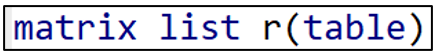
“r(table)” stores variables for each of the 320 model specifications estimated by “speccurve”. The first two stored variables are “modelno” and “specno”. We saw how “modelno” was created in the for loops above. “specno” simply sorts the models so that the model with the lowest estimate is “spec1” and the model with the largest is “spec320).
Then comes “estimate”, “min95”, “max95”, “min90”, and “max90”. These are the estimated coefficients for the war “treatment variable”, and the respective 95- and 90-confidence interval limits.
After these is a series of binary variables (“Model1”-“Model5”, “Vars1”-“Vars8”, “Y1”-“Y2”, and “Sample1”-“Sample4”) that identify the specific characteristics associated with each estimated model.
With the goal of producing TABLE 1, I next turn this matrix into a Stata dataset. The following command takes the variables stored in the matrix “r(table)” and adds them to the existing COUPE.dta dataset, giving them the same names they have in “r(table)”.

With these additions, the COUPE.dta dataset now consists of 38,843 observations and 90 variables, 26 more variables than before because of the addition of the “r(table)” variables.
I want to isolate these “r(table)” variables in order to estimate the regression of TABLE 1. To do that, I run the following lines of code:

Now the only observations and variables in Stata’s memory are the data from “r(table)”. I could run the regression now, regressing “estimate” on the respective model characteristics. However, matching variable names like “Model 1” and “Vars7” to the variable names that Coupé uses in his TABLE 1 is inconvenient and potentially confusing.
Instead, I want to produce a regression table that looks just like Coupé’s. To do that, I install a Stata package called “estout” (see below).
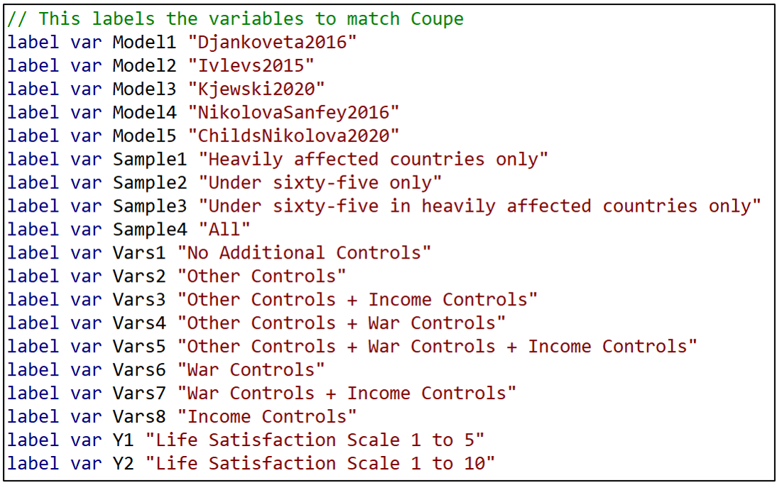
“estout” provides the option of reporting labels rather than variable names. To take advantage of that, I next assign a label to each of the model characteristic variable names.
Now I am finally in a position to estimate and report TABLE 1.
First, I regress the variable “estimate” on the respective model characteristics. To match Coupé’s table, I set the reference category equal to Model5=1, Sample4 = 1, Vars8=1, and Y2=1 and omit these from the regression.

Next I call up the command “esttab”, part of “estout”, and take advantage of the “label” option that replaces variable names with their labels.

“varwidth” formats the output table to look like Coupé’s TABLE 1. Likewise, “order” puts the variables in the same order as Coupé’s table. “se” has the table report standard errors rather than t-statistics, and b(%9.3f) reports coefficient estimates and standard errors to three decimal places, again to match Coupé’s table.
And voilá, we’re done! You can check that the resulting TABLE 1 exactly matches Coupé’s table by comparing it with TABLE 1 from the previous “specr” post.
Saving the Results
As a final action, you may want to save the table as a WORD doc for later editing. This can be done by inserting “using TABLE1.doc” (or whatever you want to call it) after “esttab” but before the comma in the command line above.
One could also save the “speccurve” dataset for later analysis using the “save” command, as below, where I have called it “speccurve_output”. This is saved as a standard .dta Stata dataset.

Conclusion
You are now all set to use Stata to reproduce the results from Coupé’s paper. Go to the OSF site given at the top of this blog, download the data and code, and run the code to produce the results in this blog. It took about 7 minutes to run on my laptop.
Of course the goal is not to just reproduce Coupé’s results, but rather to prepare you to do your own specification curve analyses. As noted above, for more examples, go to the “speccurve” GitHub site and check out “speccurve_gendata.ado”. Good luck!
NOTE: Bob Reed is Professor of Economics and the Director of UCMeta at the University of Canterbury. He can be reached at bob.reed@canterbury.ac.nz. Special thanks go to Martin Andresen for his patient assistance in answering Bob’s many questions about “speccurve”.
REFERENCES
Andresen, M. (2020). martin-andresen/speccurve [Software]. GitHub. https://github.com/martin-andresen/speccurve
REED: Using the R Package “specr” To Do Specification Curve Analysis
NOTE: The data (“COUPE.Rdata”) and code (“specr_code.R”) used for this blog can be found here: https://osf.io/e8mcf/
A Tutorial on “specr”
In a recent post, Tom Coupé encouraged readers to create specification curves to represent the robustness of their results (or lack thereof). He illustrated how this could be done using the R package “specr” (Masur & Scharkow. 2020).
In this blog, I provide instructions that allow one to reproduce Coupé’s results using a modified version of his code. In providing a line-by-line explanation of the code that reproduces Coupe’s results, it is hoped that the reader will have sufficient understanding to enable them to use the “specr” package for their own applications. Later, in a follow-up blog, I will do the same using Stata’s “speccurve” program.
Specification Curve Analysis
Specification curve analysis (Simonsohn, Simmons & Nelson, 2020), also known as multiverse analysis (Steegen et al., 2016) is used to investigate the “garden of forking paths” inherent in empirical analysis. As everyone knows, there is rarely a single, best way to estimate the relationship between a dependent variable y and a causal or treatment variable x. Researchers can disagree about the estimation procedure, control variables, samples, and even the specific variables to best represent the treatment and the outcome of interest.
When the list of equally plausible alternatives (Del Giudice & Gangestad, 2021) is relatively short, it is an easy task to estimate, and report, all alternatives. But suppose the list of equally plausible alternatives is long? What can one do then?
Specification curve analysis provides a way of estimating all reasonable alternatives and presenting the results in a way that makes it easy to determine the robustness of one’s conclusions.
The Coupé Study
In Coupé’s post, he studied five published articles, all of which investigated the long-term impact of war on life satisfaction. Despite using the same dataset (the “Life in Transition Survey” dataset), the five articles came to different conclusions about both the sign and statistical significance of the relationship between war and life satisfaction.
Complicating their interpretation, the five studies used different estimation methods, different samples, different measures of life satisfaction, and different sets of control variables. Based on these five studies, Coupé identified 320 plausible alternatives. He then produced the following specification curve.

FIGURE 1 sorts the estimates from lowest to highest. Point estimates are indicated by dots, and around each dot is a 95% confidence interval. Red dots/intervals indicate the point estimate is statistically significant. Grey dots/ intervals indicate statistical insignificance.
This specification curve vividly demonstrates the range of point estimates and statistical significances that are possible depending on the combination of specification characteristics. One clearly sees three sets of results: negative and significant, negative and insignificant, and positive and insignificant.
“specr” also comes with a feature that allows one to connect results to specific combinations of specification characteristics.

FIGURE 2 identifies the individual specification characteristics: There is one “x” variable (“WW2injury”). There are two “y” variables (“lifesatisfaction15” and “lifesatisfaction110”). There are five general estimation models corresponding to the five studies (“NikolovaSanfey2016”, “Kjewski2020”, “Ivlevs2015”, “Djankoveta2016”, and “ChildsNikolova2020”). There are 8 possible combinations of the variable sets “War Controls”, “Income”, and “Other Controls”. And there are four possible samples. This yields 1x2x5x8x4 = 320 model specifications.
The figure allows one to visually connect results to characteristics, with red (blue) markers indicating significant (insignificant) estimates, and estimates increasing in size as one moves from left to right in the figure. However, to investigate further, one needs to do a proper multivariate analysis.
Coupé chose to do this by estimating a linear regression, establishing one specification as the reference category and representing the other model characteristics with dummy variables. The reference case was defined as Model = ChildsNikolova2020, Subset = All, Controls = Income controls, and Dependent Variable = lifesatisfaction110.[1]
Because the model covariates are all dummy variables, the estimated coefficients can be directly compared. From TABLE 1 below (which is Table III in Coupé’s paper) we observe that specifications that include “Income Controls” are associated with larger (less negative, more positive) estimates of the effect of war injury on life satisfaction.

Using “specr”
Now that we know what specification curve analysis can do, the next step is to go over the code that produced these results. The following provides line-by-line explanations of the code (provided here) used to reproduce the two figures and the table above.
First, create a folder and place the dataset COUPE.RData in it. COUPE.RData is a dataset that I created using datasets from Coupé’s github site (see here).
Open R and start a new script by setting the working directory equal to that folder.

Use the library command to read in all the packages you need to run the program. Install any packages that you do not currently have installed.

The following command discourages R from reporting results using scientific notation.

Now we read in the dataset, COUPE, an R dataset.
The “setup” command
The heart of the “specr” package is the “setup” command. It lays out the individual components that will combined to produce a given specification. The syntax for the “setup” command is given below (documentation here):

It involves specifying the dataset, the treatment variable(s) (“x”), the dependent variable(s) (“y”), the sets of control variables (“controls”), and the different subsets (“subsets”). The “add_to_formula” option identifies a constant set of control variables that are included in every specification.
You will have noticed that I skipped over “model”. This is where the different estimation procedures are identified. In Coupé’s analysis, he specified five different models, each representing one of the five papers in his study. This is the most complicated part of the “setup” command, which is why I saved it for last.
Coupé named each of his models after the paper they represents. Here is how the model for Kijewski2020 is defined:
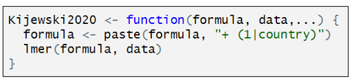
Kijewski2020 is a customized function that has three components. “formula” is defined by the combination of characteristics that define a particular specification. “data” is the dataset identified in the “setup” command, and the third line indicates that Kijewski2020 used a two-level, mixed effects models. To estimate this model, Coupé uses the R function “lmer”. The only twist here is the addition of “+(1|country)” that lets “lmer” know to include random effects at the country level.
The other studies are represented similarly. Below is how the model for ChildsNikolova2020 is defined:
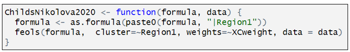
Rather than estimating a multi-level model, ChildsNikolova2020 estimates a fixed effects, OLS model. The component “|Region1” adds regional dummy variables to the variable specification. The “cluster” and “weights” options compute cluster robust standard errors (CR1-type) and allow for weighting, designed to give each country in the sample an equal weight.
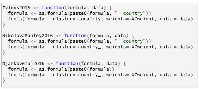
The other models are defined similarly.
Having defined the individual models, we can now assemble the individual specification components in the “setup” command.

The first several lines should be easy to interpret, having been discussed above. “subset” identifies two subsets: “sample15” = “Heavily affected countries only”; “under65” = “Under sixty-five”. “specr” turns this into four samples: (i) “sample15”, (ii) under65”, (iii) “sample15” & “under65”, and (iv) the full sample (“all”).
“controls” identifies three sets of controls. I have separated the three sets of controls to make them easier to identify. The first is what Coupé calls “Other controls”. The second is what he calls “War controls”; and the third, “Income Controls”. In combination with the option “simplify = FALSE”, “specr” turns this into 8 sets of control variables, which is equal to all possible combinations of the three sets of control variables (none, each individually, each combination between each variable, all variables). If simplify = TRUE”, had been selected, only five sets of control variables would have been included (no covariates, each individually, and all covariates).
The last element in “setup” command is “add_to_formula”. This identifies variables that are common to every specification. This option allows one to list these variables once, rather than repeating the list for each set of control variables.
FIGURE 1
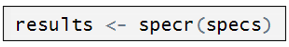
Together, the “setup” command creates an object called “specs”. In turn, “specr” takes this object and creates another object, “results”, which is then fed into subsequent “specr” functions.
And just like that, we can now use the command “plot” to produce our specification curve.

FIGURE 2
Moving on to FIGURE 2, the next set of six commands renames the respective sets of control variables and sample subsets for more convenient representation in subsequent outputs. As it is not central to running “specr”, but is only done to make the output more legible, I will only give a cursory explanation.

The “specr” command produces an object called “results$data” (see below). Inside it are contained many columns, including “x”, “y”, “model”, “controls”, “subsets”, etc. It has 320 rows, with each row containing details about the respective model specifications.
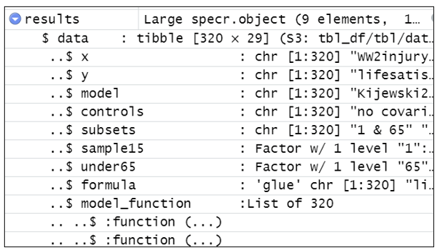
“results$data$controls” reports the variables used for each of the model specifications. Each of the six renaming commands replaces the contents of “controls” with shorter descriptions.
For example, the command below creates a temporary dataset called “tom” which is a copy of “results$data$controls”.

It looks for the text in the 10th row of “tom”, tom[10] = “recentwarmoved+recentwarinjury+recentwarHHinjury+ WW2moved”. Every time it sees that text in “tom” it replaces it with “War Controls”. It then substitutes “tom” back into “results$data$controls”.
The other five renaming commands all do something similar.
With the variable names cleaned up for legibility, we’re ready to produce FIGURE 2.

TABLE 1
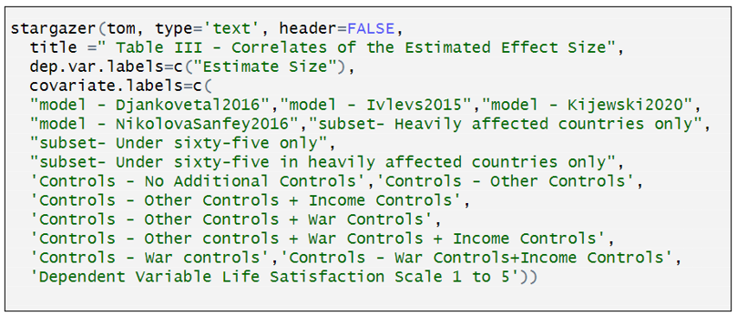
The last task is to produce TABLE 1. The estimates in TABLE 1 come from a standard OLS regression, which we again call “tom” (I don’t know where Coupé comes up with these names!).

The only thing unusual about this regression is that the dependent variable “estimate” and the explanatory variables (“model”, “subsets”, etc.) come from the dataset “results$data” described above.
We could have printed out the regression results from “tom” using the familiar “summary” command, but the output is very messy and hard to read.
Instead, we take the regression results from “tom” and use the “stargazer” package to create an attractive table. Note, however, we had to first look at the regression results from “tom” to get the correct order for naming the respective factor variables.
You can now go to the OSF site given at the top of this blog, download the data and code there, and produce the results in this blog (and Coupé’s paper). That should enable you to do your own specification curve analysis.
To learn more about “specr”, and see some more examples, go here.
NOTE: Bob Reed is Professor of Economics and the Director of UCMeta at the University of Canterbury. He can be reached at bob.reed@canterbury.ac.nz.
[1] Personally, I would have omitted the constant term and included all the model characteristics as dummy variables.
REFERENCES
Del Giudice, M., & Gangestad, S. W. (2021). A traveler’s guide to the multiverse: Promises, pitfalls, and a framework for the evaluation of analytic decisions. Advances in Methods and Practices in Psychological Science, 4(1), 1-15.
Masur, Philipp K., and Michael Scharkow. 2020. “Specr: Conducting and Visualizing Specification Curve Analyses (Version 1.0.1).” https://CRAN.R-project.org/package=specr.
Simonsohn, U., Simmons, J. P., & Nelson, L. D. (2020). Specification curve analysis. Nature Human Behaviour, 4(11), 1208-1214.
Steegen, S., Tuerlinckx, F., Gelman, A., & Vanpaemel, W. (2016). Increasing transparency through a multiverse analysis. Perspectives on Psychological Science, 11(5), 702-712.
REED & LOGCHIES: Calculating Power After Estimation – No Programming Necessary!
Introduction. Your analysis produces a statistically insignificant estimate. Is it because the effect is negligibly different from zero? Or because your research design does not have sufficient power to achieve statistical significance? Alternatively, you read that “The median statistical power [in empirical economics] is 18%, or less” (Ioannidis et al., 2017) and you wonder if the article you are reading also has low statistical power. By the end of this blog, you will be able to easily answer both questions. Without doing any programming.
An Online App. In this post, we show how to calculate statistical power post-estimation for those who are not familiar with R. To do that, we have created a Shiny App that does all the necessary calculating for the researcher (CLICK HERE). We first demonstrate how to use the online app and then showcase its usefulness.
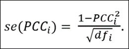
How it Works. The input window requires researchers to enter four numbers: (i) The alpha value corresponding to a two-tailed test of significance; (ii) the degrees of freedom of the regression equation; (iii) the standard error of the estimated effect; and (iv) the effect size for which the researcher wants to know the corresponding statistical power.
The input window comes pre-filled with four values to guide how researchers should enter their information. (The numbers in the table are taken from an example featured in the previous TRN blog). Once the respective information is entered, one presses the “Submit” button.
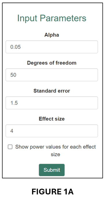
The app produces two outputs. The first is an estimate of statistical power that corresponds to the “Effect size” entered by the researcher. For example, for the numbers in the input window above, the app reports the following result: “Post hoc power corresponding to an effect size of 4, a standard error of 1.5, and df of 50 = 74.3%” (see below).

In words, this regression had a 74.3% probability of producing a statistically significant (5%, two-tailed) coefficient estimate if the true effect size was 4.
The second output is a power curve (see below).

The power curve illustrates how power changes with effect size. When the effect size is close to zero, it is unlikely that the regression will produce a statistically significant estimate. When the effect size becomes large, the probability increases, eventually asymptoting to 100%.
The power curve plot also includes two vertical lines: “Effect size” and “80% power”. The former translates the “Calculation Result” from above and places it within the plot area. The latter plots the effect size that corresponds to 80% power as a reference point.
Useful when Estimates are Statistically Insignificant. One application of post-hoc power is that it can help distinguish when statistical insignificance is due to a negligible effect size versus when it is the result of a poorly powered research design.
Tian et al. (2024), on which this blog is based, give the example of a randomized controlled trial that was designed to have 80% power for an effect size of 0.060, where 0.060 was deemed sufficiently large to represent a meaningful economic effect. Despite estimating an effect of 0.077, the study found that the estimated effect was statistically insignificant (degrees of freedom = 62). In fact, the power of the research design as it was actually implemented was only 20.7%.
We can illustrate this case in our online app. First, we enter the respective information in the input window:
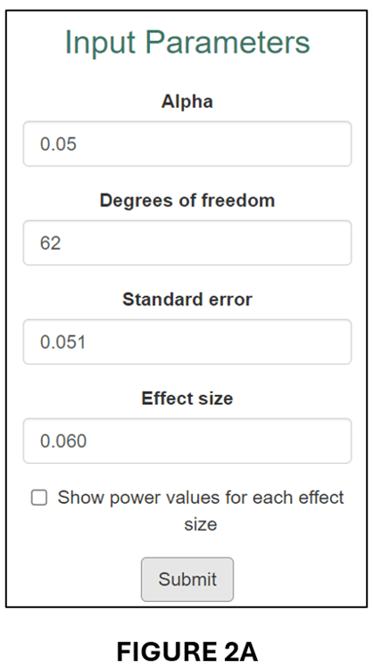
This produces the following “Calculation Result”,
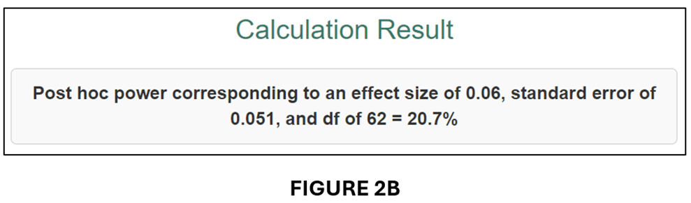
and associated Power Curve:

As it was implemented, the estimated regression model only had a 20.7% probability of producing a statistically significant estimate for an effect size (0.060) that was economically meaningful. Clearly, it would be wrong to interpret statistical insignificance in this case as indicating that the true effect was negligible.
How About When it is Difficult to Interpret Effect Sizes? The example above illustrates the case where it is straightforward to determine an economically meaningful effect size for calculating power. When it is not possible to do this, the online Post Hoc Power app can still be of use by converting estimates to “partial correlation coefficients” (PCCs).
PCCs are commonly used in meta-analyses to convert regression coefficients to a common effect size. All one needs is the estimated t-statistic and the regression equation’s degrees of freedom (df):
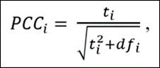
The advantage of converting regression coefficients to PCCs is that there exist guidelines for interpreting the associated economic sizes of the effects. First, though, we demonstrate how converting the previous example to a PCC leads to a very similar result.
To get the t-statistics for the previous example, we divide the estimated effect (0.077) by its standard error (0.051) to obtain t = 1.176. Given df = 62, we obtain PCC = 0.148 and se(PCC) = 0.124. We input these parameter values into the input window (see below).
The output follows below:
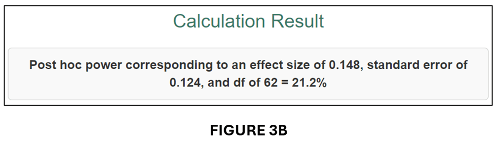
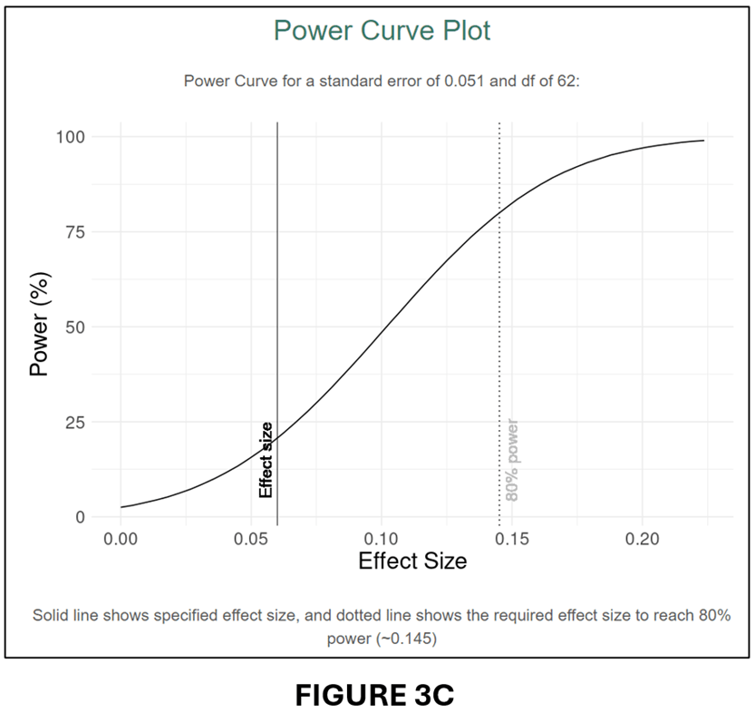
A comparison of FIGURES 3B and 2B and FIGURES 3C and 2C confirms that the conversion to PCC has produced very similar power calculations.
Calculating Power for the Most Recent issue of the American Economic Journal: Applied Economics. For our last demonstration of the usefulness of our online app, we investigate statistical power in the most recent issue of the American Economic Journal: Applied Economics (July 2024, Vol. 16, No.3).
There are a total of 16 articles in that issue. For each article, we selected one estimate that represented the main effect. Five of the articles’ did not provide sufficient information to calculate power for their main effects, usually because they clustered standard errors but did not report the number of clusters. That left 11 articles/estimated effects.
To determine statistical power, we converted all the estimates to PCC values and calculated their associated se(PCC) values (see above). We then calculated power for three effect sizes.
To select the effect sizes, we turned to a very useful paper by Chris Doucouliagos entitled “How Large is Large? Preliminary and relative guidelines for interpreting partial correlations in economics”, Doucouliagos collected 22,000 estimated effects from the economics literature and converted them to PCCs. He then rank-ordered them from smallest to largest. Reference points for “small”, “medium” and “large” were set at the 25th, 50th, and 75th percentile values. For the full dataset, the corresponding PCC values were 0.07, 0.17, and 0.33.
Our power analysis will calculate statistical power for these three effect sizes. Specifically, we want to know how much statistical power each of the studies in the most recent issue of the AEJ: Applied Economics had to produce significant estimates for effect sizes corresponding to “small”, “medium”, and “large”. The results are reported in the table below.

We can use this table to answer the question: Are studies in the most recent issue of the AEJ: Applied Economics underpowered? Based on a very limited sample, our answer would be some are, but most are not. The median power of the 11 studies we investigated was 81.8% for a “small” effect. These results differ substantially from what Ioannidis et al. (2017) found. Why the different conclusions? We have some ideas, but they will have to wait for a more comprehensive analysis. However the point of this example was not to challenge Ioannidis et al.’s conclusion. It is merely to show how useful, and easy, calculating post hoc power can be. Everybody should do it!
NOTE: Bob Reed is Professor of Economics and the Director of UCMeta at the University of Canterbury. He can be reached at bob.reed@canterbury.ac.nz. Thomas Logchies is a Master of Commerce (Economics) student at the University of Canterbury. He was responsible for creating the Shiny App for this blog. His email address is thomas.logchies@pg.canterbury.ac.nz .
REFERENCE

You must be logged in to post a comment.